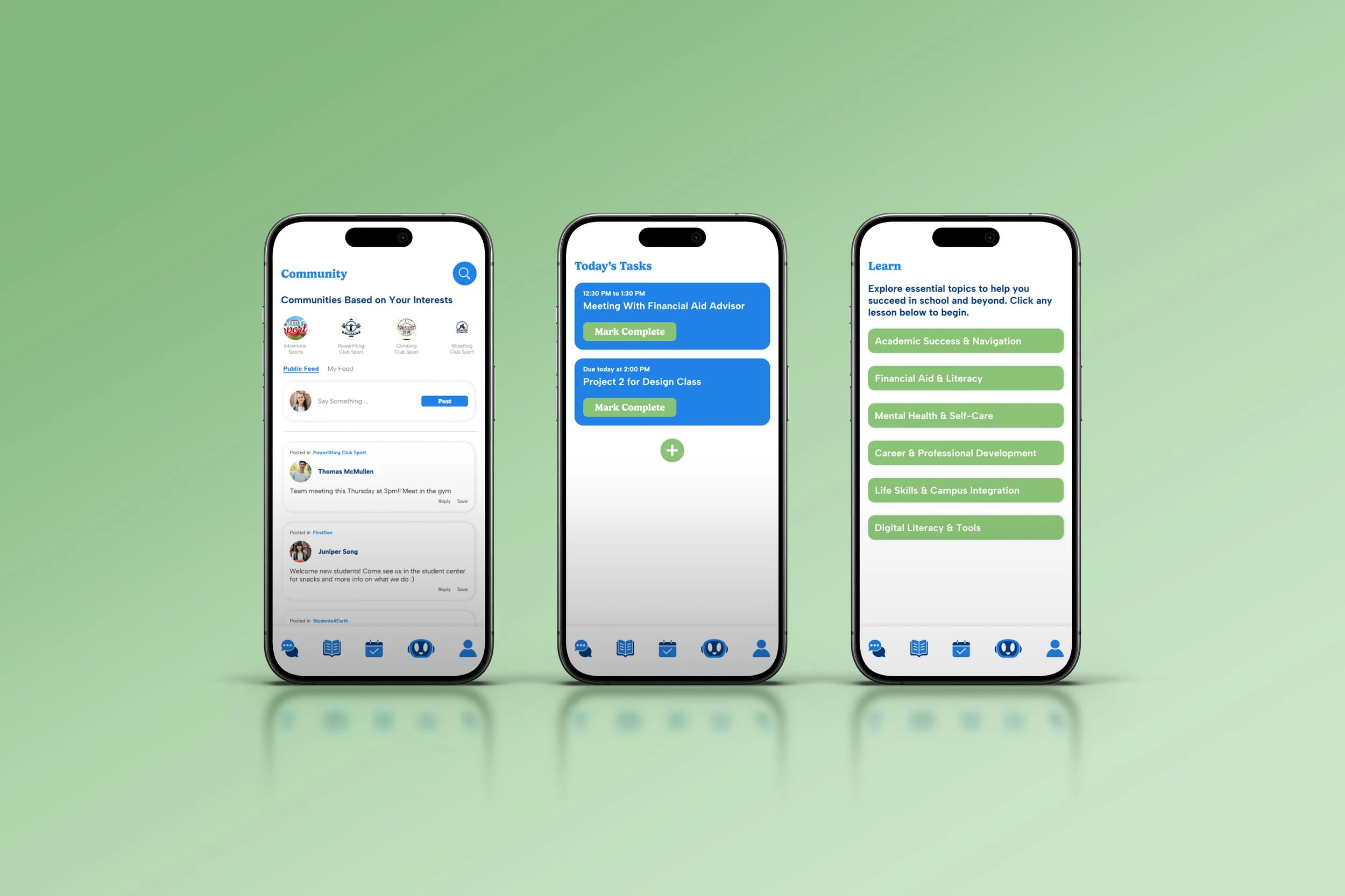
EduBridge: Empowering First-Gen Students Through Better College Prep
Personal Project
The Challenge: First-generation students often lack mentorship, financial literacy, and academic advising, leading to confusion, isolation, and higher dropout rates.
Only 27% of first-gen students graduate within 4 years (vs. 42% of peers)
They often feel alone, under-supported, and confused about next steps
Existing tools focus on college applications, not post-admission success
User Goals:
Understand what’s available beyond high school (college, trades, etc.)
Get help navigating financial aid, tutoring, deadlines
Connect with real people for support
Business & Tech Constraints:
Must work on older Android devices & low Wi-Fi
Budget: No high-cost integrations
Tone: Empowering, empathetic, non-corporate
My Role: UX Designer, Researcher
Tools: Figma
Target Persona: Maria Rivera
“I’m trying to stay in school, but I don’t know who to ask for help. It feels like everyone else has a map and I’m just guessing.”
Age: 18
Background: First-gen student, child of immigrants
Pain Points: Feels overwhelmed, doesn’t understand academic systems, unsure who to ask
Tech: Phone-dependent, not familiar with portals or educational terms
Key Findings from Research
1 in 3 U.S. college students are first-gen
First-gen students face:
Imposter syndrome
Financial confusion
Lack of peer/community support
Strong desire for bite-sized help, clear next steps, and relatable stories
YouVisit
Strength: Campus tours
Gap: Lacks guidance
Common App
Strength: Application support
Gap: No support post-admission
Competitive Audit Summary
RaiseMe
Strength: Scholarships, gamified rewards
Gap: Focused on high school only
Scholly
Strength: Easy scholarship search
Gap: No advising or help
Design Implications
Theme: Lack of guidance
What This Means for UX: Scaffold info into steps and tasks
Theme: Feeling isolated
What This Means for UX: Include community and learning
Theme: Confusion
What This Means for UX: Use visuals (checklists, FAQs, learning)
Theme: Low digital literacy
What This Means for UX: Ultra-simple flows, chunked content
Theme: Limited access
What This Means for UX: Must work offline and load quickly, no heavy integrations
Brainstormed Features:
Guided onboarding
Learning modules, bit-sized information
Task list
FAQ Chatbot
Community feature
Focused on low-lift, high-impact features
De-prioritized anything requiring heavy backend or AI training
Ideation & Strategy
Usability Testing
Due to limited access to users during the project, I used a heuristic evaluation to validate the design and ensure usability across key flows. These principles helped identify design strengths and ensure the experience is intuitive for first-generation students who may be unfamiliar with higher-ed systems or mobile platforms. Ideally, usability testing would utilize real users for better feedback and iteration.
Heuristic Evaluation Results:
Visibility of System Status: Pass
A persistent progress bar on learning modules shows users how far they’ve come.
After each action, there’s immediate visual feedback (e.g., checkmarks, confirmation banners) that confirms completion.
Why It Matters: Many first-gen students fear “doing something wrong.” Visible feedback reduces uncertainty and builds confidence.
System & Real World Connections: Pass
Used simple language and described academic terms
Icons and labels reflect real-life metaphors: a calendar for deadlines/tasks, a chat bubble for community, and a book for learning.
Why It Matters: Students unfamiliar with education systems benefit from simple, real-world language and visual cues.
User Control & Freedom: Pass
Users can select their preferred display language during onboarding, ensuring the app experience is accessible and comfortable from the start.
Users can skip onboarding steps, go back, exit, or start over.
Why It Matters: Students need to feel in control, especially when trying something new. Control reduces anxiety and promotes exploration.
Consistency: Pass
Buttons, icons, and layouts follow a uniform design system across all screens.
Standard mobile conventions are respected (e.g., bottom nav icons, tapping, swiping).
Why It Matters: Familiarity allows students to navigate confidently without needing to learn the app’s logic.
Error Prevention & Recovery: Pass
“Undo” options appear in task completion.
The FAQ chatbot clearly states that it is AI-powered and routes users to human advisors for complex or sensitive questions, preventing misinformation.
Why It Matters: Preventing errors is critical when working with students who may feel unsure or unfamiliar with digital tools.
Recognition Over Recall: Pass
The task tab surfaces all daily to-dos clearly so students never have to remember what to do next.
The learning module uses a progress bar and bite-sized chunks to show students where they are in the lesson, minimizing mental load.
The community feed highlights active club or organization posts and "Follow" buttons, requiring no prior knowledge to engage.
The FAQ chatbot offers quick suggestions and recently asked questions to reduce the need to recall how to phrase a query.
Why It Matters: Many students are juggling school, work, and family. The interface needs to reduce friction and make it easy to “see and do” not “remember and guess.”
Flexibility and Efficiency of Use: Pass
Users can quickly create, complete, or delete tasks in just one or two taps, making the task system fast for daily check-ins.
The learning module accommodates both fast and slower learners: users can complete modules in small bites or download the full PDF summary at the end to review offline or all at once.
Language selection during onboarding ensures the experience adapts to users' preferred communication style right from the start.
Why It Matters: Flexibility supports both new and returning students. Efficiency in task management, module access, and language personalization helps EduBridge fit naturally into busy, diverse lives.
Aesthetic & Minimal Design: Pass
The interface uses ample white space, clean typography, and a limited color palette to avoid overwhelming students.
Visual hierarchy is maintained using consistent typographic scales, spacing, and iconography for better scanability.
The design meets WCAG 2.1 AA accessibility standards, including sufficient color contrast between text and background, clear focus states for interactive elements, and tap targets optimized for mobile accessibility.
Why It Matters: First-gen students can feel overwhelmed quickly; minimal design ensures clarity and focus.
Help and Documentation: Pass
FAQ chatbot assists with common questions (“How do I apply?”, “What’s FAFSA?”).
Why It Matters: On-demand help builds trust, especially when students don’t know who to ask.

Final Prototype
*Desktop view is optimal
Next Steps
Expand language options
Add mentor/counselor feature
Develop mentor/counselor dashboard
Final Thought
EduBridge is a pocket-sized guide for students who feel like they’re figuring out college alone. Through thoughtful design, EduBridge helps make their path just a little clearer.

